|
|


 03-05-2013, 01:12 PM
I can defiantly do that. I can also send you the file as well.
 01' WJ Limited, 33's, LA's etc.... JF 09' GCOTY
 03-05-2013, 07:06 PM
I was screwing around at lunch (new computer at work) dont know if this helps.
03-05-2013, 10:22 PM
John (311WJ) - Can you post the original file here? Or PM me and I'll give you my email address.
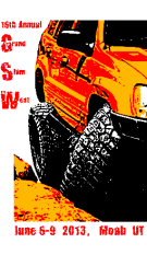
John Z - I like your rendition a lot, I have some suggested tweeks:
1. Rocks should be the same color as the Jeep.
2. Remove the GSW labels - those will need to be bigger (more on this later).
3. Add more black to the tires, bumper and rocker protection.
4. Remove the beveled border.
Now, we need to add the event text, which must include: 16th Annual Grand Slam West Moab, Utah June 6-9, 2013
John Z - I really like the font you used on the "GSW 2013" text that's in the lower right corner.
I also like the layout style Jeremiah used on his design on the previous page where vertically it reads GSW and horizontally the words are spelled out.
In order to have room for the text, we need to add some white space around the original picture - I don't think we can do this with the free web app, but I can do it with my tools.
Comments?
(I like this collaborative form of design!)

 03-06-2013, 12:22 AM
It's looking great!
03-06-2013, 11:00 AM
Best I can do. To get blacker tires I had to make it redder. (contrast)
03-06-2013, 11:22 AM
Here are some fonts
Last edited by ZJ TINS; 03-06-2013 at 11:24 AM.
03-08-2013, 04:36 PM
Tom thinks this is the final verison and wants comments.
Everything white will be clear (T shirt color) but note the jeep 'white' is in fact light grey (shade of black). not sure if the t shirt color will come through or if white and black are used. Tom might know.
Last edited by ZJ TINS; 03-12-2013 at 04:19 PM.
03-09-2013, 12:04 AM
Can somebody less photoshop-tarded than I am put a sand background on that please?
I've found that white t-shirts get yellow collar really fast (sweat + sunblock), so I try to shoot for the sand color shirt since black gets hot in the sun.
Remember I'll be adding additional colors this year: sky blue, steel blue and pistachio (medium earthy green). Also considering adding a girly color based on an off-hand comment made by Jeremiah - possibly lavender. Will need to consult with the printer to see what girly color that design will look good on.
03-09-2013, 02:40 AM
Just my wife is big on breast cancer awareness for the pink.
And I like the black cause I wear it year round and it looks better for longer!
 03-09-2013, 11:09 AM
I think it looks great - thanks to the "graphic artists" who contributed. Tom, once again you did an excellent job of managing this project! It was fun watching the collaboration and how this came together!
03-09-2013, 02:09 PM
I could make the shirts in pink, but those colors will look horrible on pink. We'd probably need to change the colors for the run to blue or purple. Or maybe change the orange & yellow combo to red. If you really want to print on a pink shirt, play around with the colors and give me an option.
 03-09-2013, 03:14 PM
Pam might be in on a blue or purple shirt, but no way she'd get a pink one.
Trying to be as specific as possible here, it won't be purple, needs to be lighter, so thinking of lavender.
03-09-2013, 03:56 PM
Close enough.

I really like the graphic and would probably lean more towards the steel blue and black colors. The Moab red dirt shirt I have I love for wearing, but it hasn't been an option. It looks good in pictures in Moab too.
03-12-2013, 04:16 PM
WARNING: The red and yellow are not solid colors to auto fill with another color someone needs to find a tool to let them do than. It is impossible with a simple fill tool (as in paint).
Last edited by ZJ TINS; 03-14-2013 at 08:51 AM.
 03-12-2013, 06:25 PM
I did this in Gimp by enhancing the contrast, "posterizing" the image to 4 colors (which converted the orange to yellow for some reason), then converted the yellow to the shade of orange you had. The 4 colors are red, orange, black and white -- the white can easily be converted to transparent which would leave you with only 3 colors.
You'll also want to make sure that the final image is a lossless PNG or BMP file. JPG's compress the file and can introduce some "extra" colors from the compression.
If something like this is acceptable (You may want to re-do the text after it's edited), feel free to send me a higher-res version and I can play with it to see if I get something acceptable. Although I will happily defer that chore to an actual graphic artist as I'm sure they could do a much better job than me.
I'm still trying to get the original file from 311. If think the screen printer prefers tiff files.
03-13-2013, 09:41 AM
Tom the one I sent (and Sir Fuego 4 colored, thanks) blows up to 14" tall very nicely. Since he has four colors I dont think you need any better res it should work fine. The minute detail is all gone anyway from the processing.
Sir Fuego can you remove he white and send to Tom? At least he can print it and see if that works.
03-13-2013, 11:30 AM
PM me an e-mail address. I have the "3 color" version ready with the white converted to transparent in both PNG and TIF(no compression) format -- whichever is preferred. I should be able to save it to any other common format, so let me know.
Last edited by SirFuego; 03-13-2013 at 11:37 AM.
03-13-2013, 11:47 AM
03-13-2013, 12:38 PM
Lets see what Tom thinks... thanks Sir Fuego.
03-14-2013, 02:02 PM
SirFuego - the OCD in me demands that the "16th Annual Grand Slam West" text be contained within the rectangle of the original picture. Ideally we could stretch the rock leftwards to the edge of the white (along with the bottom text). If we can't do that, then we'll need to move the GSW text inward (and possibly reduce it size).
What do you think?
03-14-2013, 03:14 PM
I extended the rock with some copy/pasting of an odd shaped brush to kind of randomize it (I'm not a graphic artist, so hopefully it doesn't look too bad). IMO, there wasn't enough room to just move the text over and make it smaller.
https://www.dropbox.com/s/dbuvyyd8y6...irt_3color.tif
The background should be transparent with only red, orange and black as the colors. There were some "rogue" pixels of random colors I found, so those should be gone now.
I'm not sure what font was used, but the text should probably be touched up if the gaps are too large when it scales.
Last edited by SirFuego; 03-14-2013 at 03:24 PM.
| « Previous Thread | Next Thread » |
| Thread Information |
Users Browsing this ThreadThere are currently 1 users browsing this thread. (0 members and 1 guests) |